
Dashboard · 8 min read · Aug 16, 2026
Quick Customer Dashboard for Shopify: A Side Panel That Turns Logins Into Repeat Orders
By Ritesh Vatwani
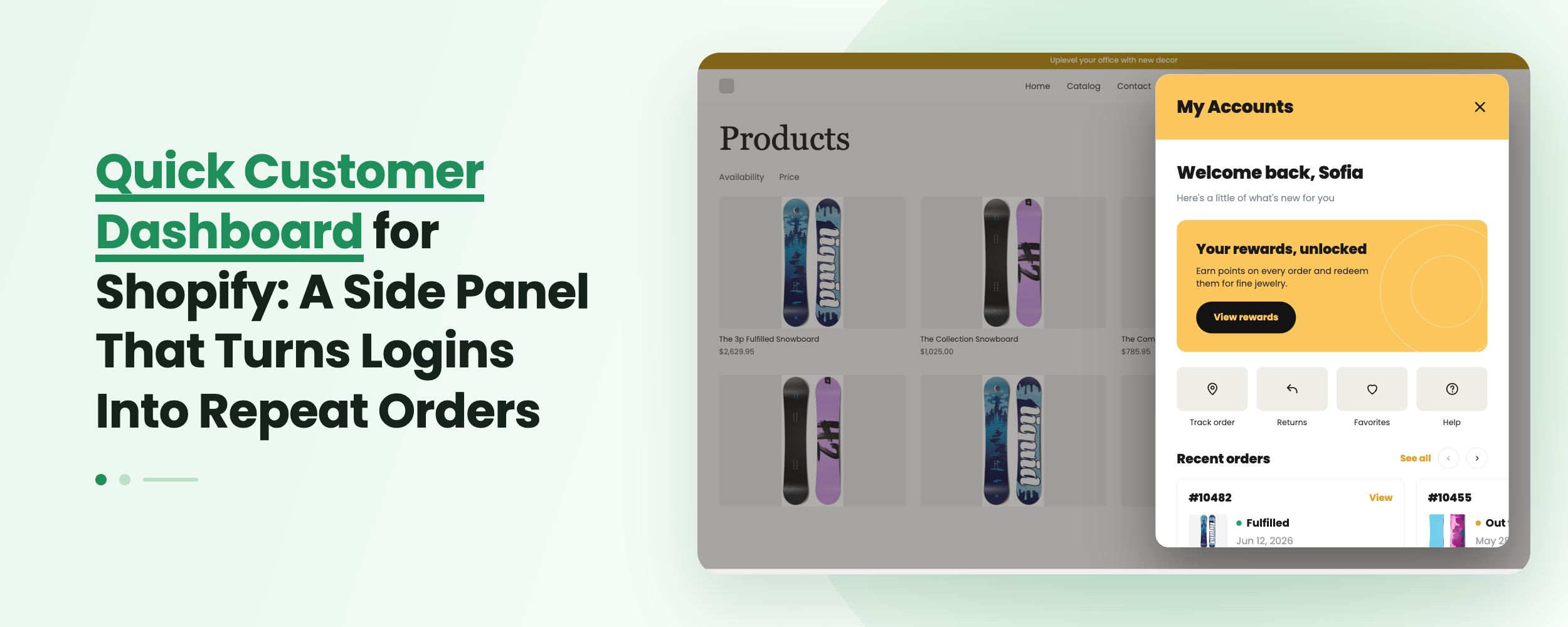
A quick customer dashboard is a slide-out side panel that opens over your Shopify storefront and shows a logged-in shopper their recent orders, buy again products, wishlist, subscriptions and quick actions without ever leaving the page they are on. It works like a mini customer portal docked to your header, so account access becomes a one-tap action instead of a full page redirect. Accofy lets you build, brand and translate that panel with no code, including separate designs for before login and after login.
Key Takeaways
- A quick dashboard is a side panel version of the account page, opened from your header, that keeps shoppers in the shopping flow.
- It shows a promo banner, recent orders with live status, buy again, wishlist, quick actions and subscription details in one scrollable column.
- You control two states: a before login panel that converts visitors into sign-ins, and an after login panel that drives the next order.
- Accofy ships this as a no-code, drag-to-reorder, fully translatable feature for Shopify's new customer accounts.
What Is a Quick Customer Dashboard?
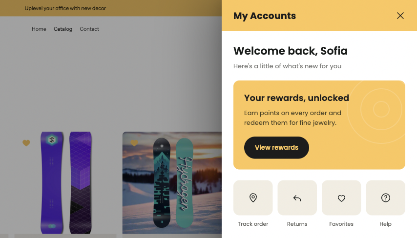
A quick customer dashboard is a compact, slide-out account panel that overlays your storefront instead of replacing it. The shopper taps an account icon in your header, the panel slides in from the side, and everything they usually go to `/account` for is right there: order history, order status, saved products, reorder buttons and profile links. It is a Shopify customer dashboard in miniature, delivered where the shopper already is.
Think of it as the difference between a drawer cart and a cart page. Nobody sends a shopper to a separate cart page anymore, because the drawer keeps them browsing. The account page is still stuck in the old pattern: click your name, get redirected, lose your place, and hopefully come back. The quick dashboard closes that gap with the same customer portal logic, delivered as a slide-out account widget.
This matters more now that Shopify's new customer accounts use passwordless, one-time code sign-in. Logging in takes seconds, so far more shoppers are already authenticated while they browse. Making them navigate away to check an order status is friction you no longer need to charge them.
Why Does a Side Panel Beat a Full Account Page?
A full account page is still essential. It is where deep tasks live: detailed order views, returns, address books, custom profile fields, warranty claims and digital downloads. The quick dashboard is not a replacement, it is the fast lane in front of it, and it wins on three specific jobs.
It removes the redirect. A shopper mid-browse who wants to check "did my order ship" opens the panel, reads the status, closes it, and keeps shopping. Session preserved, cart untouched, momentum intact.
It puts reorder prompts inside the shopping session. A buy again row that appears while someone is already on a product page is a very different prompt from one buried two clicks deep on a page they visit once a month.
It is built for thumbs. A side panel is a single tap that covers the viewport, scrolls in one column, and dismisses with a swipe. Most Shopify traffic is mobile, so the panel is the format that actually gets used.
What Goes Inside the Quick Dashboard Panel?
The panel is built from stackable sections. You switch each one on or off, then drag them into the order that suits your store using Panel Order.
Promo Banner
The first thing a logged-in shopper sees can be a sale banner, a new collection, a free shipping threshold or a referral prompt. This is prime placement: an image block at the top of a panel opened by a customer who already buys from you. Same principle as turning your customer account page into a marketing channel with static blocks, compressed into a panel.
Recent Orders
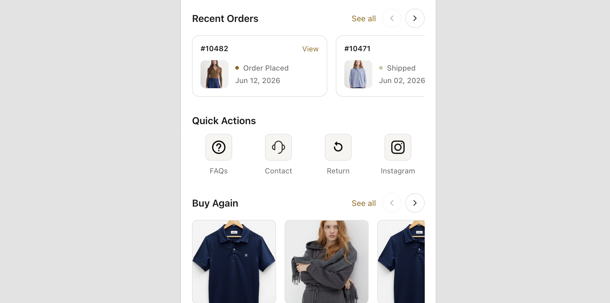
A card row showing the last few orders with product thumbnails, order numbers, a colored status dot (Order Placed, Shipped, Delivered) and the order date, plus a See all link into the full account. This one section absorbs your highest volume "where is my order" tickets, because the answer is one tap from any page in the store.
Buy Again
One-click reorder for products the customer has already bought. For consumables, refills, coffee, supplements, skincare and pet food, this is the highest intent block in the panel. The shopper does not have to search or remember the variant, they tap and it is in the cart.
Wishlist
Surfacing saved products in the panel means a shopper can pull up their wishlist while browsing a category and add an item without breaking stride. Saved intent only earns revenue when it is easy to reach.
Quick Actions
The shortcut row: track an order, start a return, view addresses, edit profile, contact support, log out. Giving each task a labelled button removes the hunt.
Subscription
For subscription and replenishment brands, the panel shows the next charge date and plan status with a link into full management. Answering "when is my next box" without a redirect prevents cancellations that start as confusion.
How Do Before Login and After Login Panels Differ?
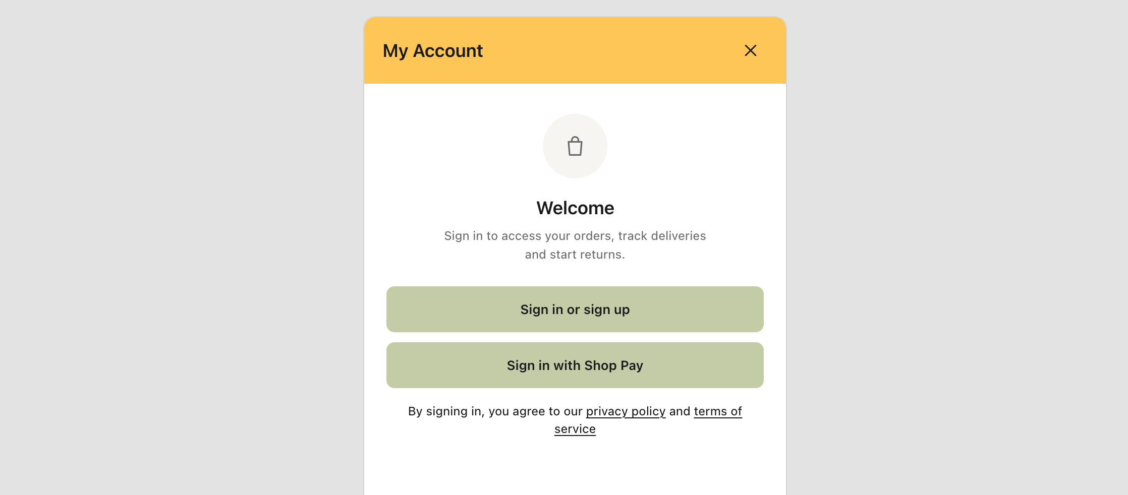
This is where the quick dashboard earns its keep for acquisition as well as retention. You design two separate states.
The Before login panel is what an anonymous visitor sees when they tap the account icon. Instead of a bare email field, you can lead with a reason to sign in: a welcome message, a first-order offer, a promo banner, the benefits of an account, and then the passwordless sign-in field. You are selling the account, not just requesting a login.
The After login panel is the personalized version: a greeting by first name, a line like "Here's a little of what's new for you", then the promo banner, recent orders, buy again and everything else. Same panel, completely different job.
Splitting the two lets you optimize separately. If sign-ups are your bottleneck, work the before login state. If repeat rate is your bottleneck, work the after login state.
How Do You Set Up a Quick Dashboard With Accofy?
The whole thing is a no-code build in the Accofy editor.
Enable the panel. Open Quick Dashboard in Accofy and switch Enabled on. The panel attaches to your storefront account icon.
Pick the state you are designing. Toggle between Before login and After login at the top. Every setting below applies to the state you have selected.
Turn on the sections you want. Open Sections and enable Promo Banner, Recent Orders, Buy Again, Wishlist, Quick Actions and Subscription as they apply to your catalog. A short, relevant panel outperforms a long, generic one.
Set the panel order. Use Panel Order to drag sections into sequence. Replenishment brands should push Buy Again near the top. Fashion and high-consideration brands usually lead with Recent Orders or the Promo Banner.
Style it to your brand. Set colors, spacing, corner radius, header background and typography in the design and font settings, and add custom CSS if you need to match something exact. The panel should read as part of your storefront, not a bolted-on widget.
Translate the copy. Open Language changes to rewrite every label and heading, then translate into each language your store sells in. "My Account", "Recent Orders" and "Buy Again" are all editable, so the panel speaks in your brand voice.
Preview and save. Switch to the mobile view in the preview toolbar, sign in as a test customer, confirm both states behave, then hit Save.
Which Stores Get the Most From a Quick Dashboard?
Replenishment and subscription brands gain the most, because buy again and next charge date are the two things their customers check constantly. High order-volume stores cut support load, since order status becomes self-serve from any page. Mobile-heavy brands benefit because the panel format suits small screens far better than a redirect. Stores with a strong wishlist habit convert more saved items, and any brand pushing a promotion gets a guaranteed impression in front of logged-in buyers.
If your account page traffic is high but your repeat rate is flat, the panel is usually the cheapest fix available. For the wider picture on what a modern account hub should contain, see our guide on what a good Shopify customer dashboard looks like, and for the data side, custom fields in the new customer account.
Final Thoughts
The account page stopped being a dead end the moment Shopify made login effortless. What has not caught up is the format. Sending a logged-in shopper away from your storefront to answer a five second question is a habit worth breaking, and the quick customer dashboard breaks it: recent orders, buy again, wishlist, subscriptions and a promo slot, all in a panel that opens over whatever page they are already on. It serves the customer faster and sells at the same time, which is the whole point of a customer account in 2026. If you also sell digital products, the same logic applies to digital downloads in the customer account, and the underlying technology is covered in our Shopify account web component guide.
Ready to give your customers a one-tap account? Install Accofy on the Shopify App Store and build your quick customer dashboard panel today. Learn more at getaccofy.com.